Diego Velazquez, along with Goya, is one of my favorite classical painters. they both had a surreal and very stylized idea of what a work of art should be.
This one image, though, is an attempt at art imitating art. It's a recreation of Las Meninas by Velazquez done by Joel-Peter Witkin. And I have to say that this is one of his less disturbing photographs, he loved the macabre and enjoyed tickling our voyeur bone with his morbid images of mostly bondage.
Source: Fotodoc
Tuesday, June 24, 2008
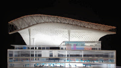
Fuksas' Shenzhen Airport
image taken from the architect's website
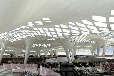
I'm loving Shenzhen's International's new terminal designed by Fuksas. It's tubelike perforated canopy structure, that is splayed open in some parts and spreads out like wings, or an amoebic organism, is a new take on the currently typical airport design of two buildings in one. One building being the large roof that protects us from the environment, and the other being the scattered structures that riddle the interior. The first has open views to the outside and is planned as an open space, so it allows for "flexibility due to the unpredictability of the aviation industry."
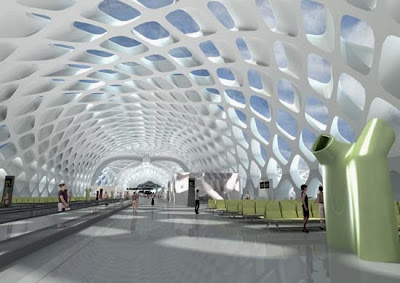
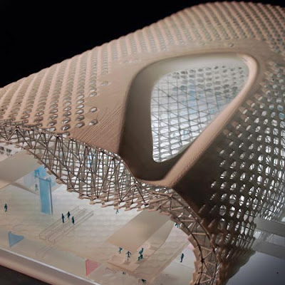
What is new about this one is the more minimalist appearance that is achieved. This canopy structure has two skins, one on the outside of the structure, and one on the inside. This particularity, the double skin, helps to hide the structure from the inside, giving the visitors a cleaner look and reducing the amount of perceptual noise of the huge roof structure. The topside of the roof is of an almost regular shape along the concourses and terminals, like a slightly tweaked oval pipe. But on the inside the flowing shapes bellow and retract more like an organism's skin. The concept of the interior space is fluidity which means two different characters, "one is movement, the other is pause". Retail spaces and lounges will be "islands for pause" that seem only natural within the fluid main space.
This double layered organically shaped spaceframe construction allows for flexibility not only in the spatial arrangement of the terminal itself, but also of the service spaces. The structure itself could be thick enough to house mechanical equipment in it. but they hint more towards the more typical approach of cooling or heating from the spaces underneath the main concourse floor. Using sculptural organic shapes to throw air to the inside of the main space.
And just as I imagined, the double layered skin is designed to reduce direct sunlight towards the inside, while still allowing for natural light. Since the airport is located in Shenzhen very near Hong Kong, which is tropical in climate. It shares latitudes with Cancun and Northern Cuba. So passive solar design is a very important factor in the building. The perforations on the skins perform much like deep set windows, allowing for light to come in while blocking direct sunlight. Although every once in a while large perforation appear, they are called "plazas", and I assume that apart from giving us direct sunlight, they will also work as the smoking areas for our cancer prone fellow travelers.
I don't know if construction has started on this building, so I still don't have a specific location for it. What I do know is that it will definitely be a building worth visiting at least once in a lifetime.
Sources:
Contemporary Airport Design - Pictorial guide of new airports around the world, DesignBoom
EuropaConcorsi's portfolio page of the Shenzhen Airport
Shenzhen InternationalAirport Terminal 3 by Massimiliano and Doriana Fuksas, Dezeen
Massimiliano Fuksas Architetto website
Sunday, June 22, 2008
Airpot Design at DesignBoom
A very justified distraction from the search for self identity is this interesting document that Designboom has put together about airport design. Most of them have been designed in the last decade, which I agree has been very prolific for good airport design.
- DOHA International Airport in Qatar, by HOK
- Islamabad International Airport in Pakistan, by Downer EDI Ltd. & CPG Corporation
- Carrasco International Airport Expansion in Uruguay, by Rafael Viñoly
- Incheon International Airport and Transportation Center in Korea, by Samoo Architects and DMJM + TF&P
- Indianapolis International Airport in Indiana, by HOK (again)
- Shenzhen International Airport in China (one of my favorites), by Massimiliano Fuksas
- Bangkok International Airport in Thailand, by Murphy/Jahn
- Beijing International Airport in China (just opened last month), by Foster + Partners
- Heathrow Intl. Terminal 5 in the UK, by Rogers Stirk Harbour + Partners
- Hyderabad International Airport in India, by GMR Group, and a bunch of other people
- Bangalore International Airport also in India, by Kauffman Van Der Meer + Partner AG
- Miami International Airport in the USA, by Rizo Carreño & Partners with Borelli & Associates
- Toronto Pearson International Airport in Canada, by Moshe Safdie and Associates
- Shanghai Pudong International Airport in China (really cool unknown for me), by Rogers Stirk Harbour + Partners
- Abu Dhabi International Airport terminal 2 in the UAE, by Paul Andreu
- Madrid Barajas International Airport in Spain, by Rogers Stirk Harbour + Partners
- Zaragoza Airport in Spain, by Vidal y Asociados Arquitectos
- Jeddah International Airport in Saudi Arabia (another favorite of mine), by OMA
- Sendai International Airport in Japan, by HOK with Azusa Sekkei co. ltd.
- Ben Gurion International Airport in Israel, by Moshe Safdie and Associates with SOM, Karmi Architects and TRA Architects
- Madeira Funchal Airport extension in Portugal, by Segadaes Tavares e Associados
- Incheon International Airport in Korea, by Fentress Architects
- Sondica International Airport in Spain, by Santiago Calatrava
Saturday, June 21, 2008
Finally... some definition
After blogging here on and off for the better part of a year, I have finally made the decision as to what this blog is about. I have decided that this little publication is going to be an archive of my journey into self identity as an architect. Of how my worries on space, phenomenology, ecology, materials, and tectonics, with a dash of the music and art that inspires me, shapes my own design trajectory.
You will see new thing appear in my posts. One of the new things are the categories in which I have separated my posts, as of now there are five categories; you'll see them at the start of each post.
Self-explanatory category... This one is to study complete buildings that I deem important to learn from.
In this one it's going to be just a part of a building that's going to be studied. Sometimes the whole building is characterized or can be summed up with one element of their design.
More categories will probably appear as I go along, but one that probably won't is any one category about one specific architect. I love Renzo Piano's work, but I won't feature him here.
This is where I'll put the art, as painting, photography, or graphic design, that inspires me to work, draw ideas from, or just plain like.
I'm an easily distracted person, so Aural Pleasures is the place I immerse when I'm in need of isolation, so I can get on a roll with working on my ideas.
One of the important things that I really love is traveling. Architourism and Geo-Positioning works of architecture is a really large part of what I like.
Since I get distracted easily, I will from time to time post something unrelated to architecture or my work, being posted here will be justifiable.
Saturday, June 14, 2008
Wednesday, June 11, 2008
Bird's Nest Lecture at Tate Modern
In the Online Events section of the Tate Modern Museum's website there is a really incredible hour and twenty minutes long lecture done by Jacques Herzog on the Beijing Olympics National Stadium, or Bird's Nest. The lecture is one of a series called Real Architecture done in Spring of 2008.
Enjoy the lecture, even if Herzog speaks a little slow for you. Or enjoy a few pictures of the Stadium and its construction process.
via architecturephoto.net
Enjoy the lecture, even if Herzog speaks a little slow for you. Or enjoy a few pictures of the Stadium and its construction process.
via architecturephoto.net
Monday, June 9, 2008
100 Best
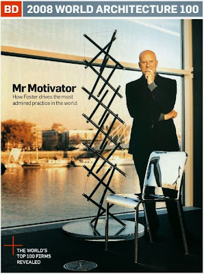
BD Online has released their annual list of the best 100 architecture firms in the world in their last issue. And most of the starchitects didn't even make the top 100 since this list has to do more with size and income than with good architecture, if the list were to be about architecture instead of revenue, the list would be much longer, and probably piss a lot of people along the way.
The only starchitects I identified in the list are:
5 - Foster and Partners
51 - Herzog & De Meuron
71 - Grimshaw
76 - David Chipperfield Architects
83 - Coop Himmelblau
There's, of course, a lot of very well known firms. But most of them don't behave like stars or are hired because their name has become a brand.
Wednesday, June 4, 2008
Subscribe to:
Posts (Atom)